
I lately considered trying to get new things in my apainting. You know, just to stay out of the confrot zone to see where things can be improved.
One of the things I've been intrigued about for a long time is colour theory. I admit that apart from reading about it from a book by Kandinsky which left me with numerous questions, I left this matter aside, and kept on painting things as I was used to.
If you're into fantasy and wargaming, I'm pretty sure the name of such artists as Frank Frazetta and Simon Bisley are common for you. One thing I always found fascinating in their work is how they add what appears to be "weird" colours like blue or green to skintones to enhance the contrasts (that and the numerous boobs and weapons of course).
 |
| From Simon Bisley |
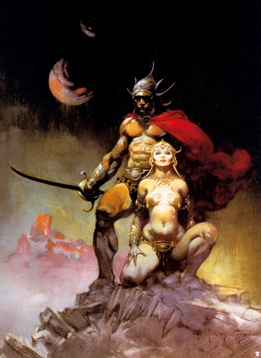 |
| From Frank Frazetta |
You can find this in many other artists Like Gauguin :
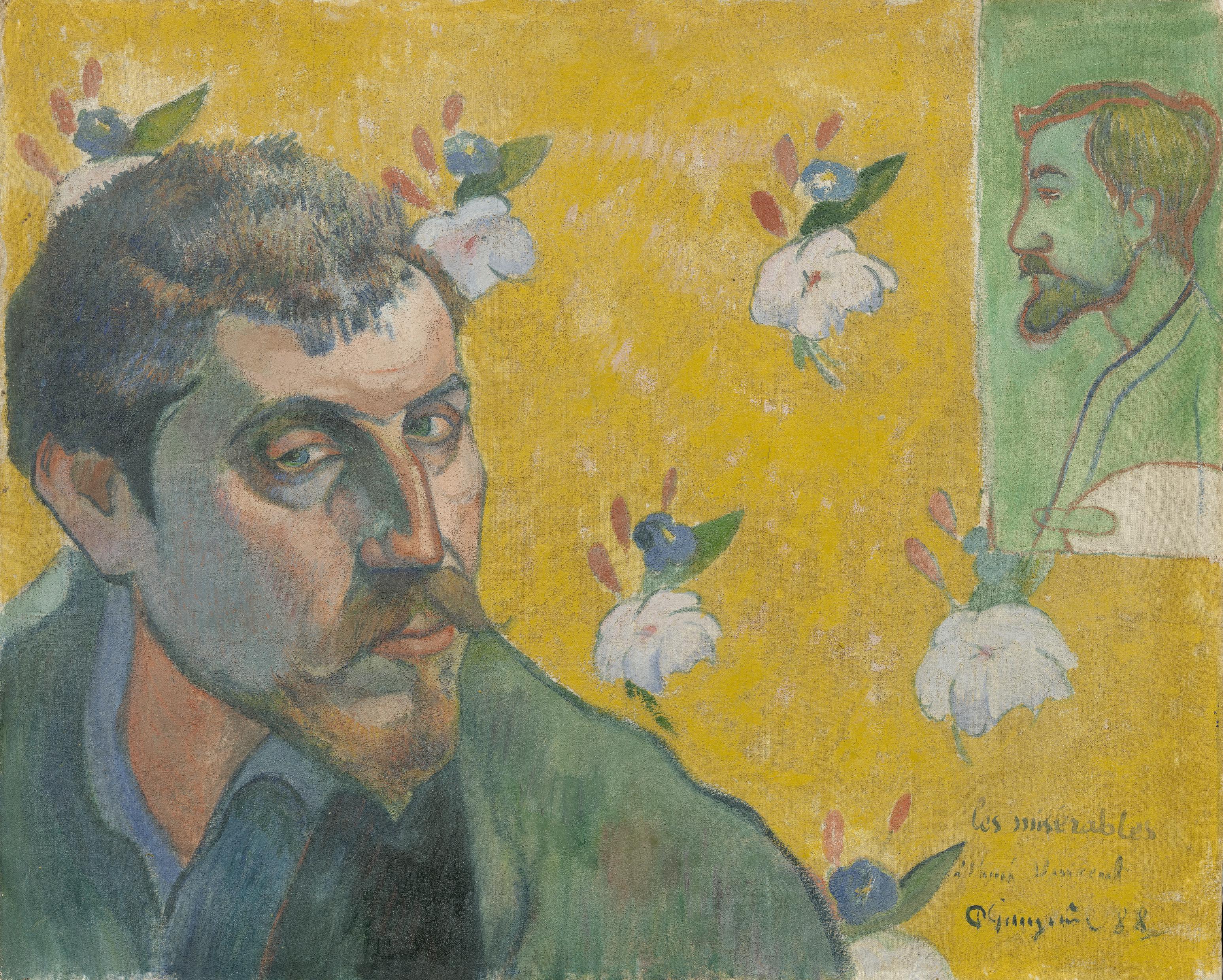
They all depict these multiple contrasts with dark and light, cold and warm, desaturated and bright colours.
I'm not reinventing the colour wheel here since you can already all see such concepts applied in a lot of models. It's just right now I'm intrigued about it and want to learn more about it.
Since I like to get my peronnal opinion first, I decided to give a go and see how things could end up.
So starting with this guy whose skintone's base colour is the famous "swamp brown", I decided to work with a deep blue to add shades and my beloved cadmium red to make the highlights. This way I get a good warm/cold contrast I guess.

What you can see below are my favourite colours at the moment. Cadmium red is the best thing that happenned to me since Badab Black and Devlan Mud. The deep marine blue is also a very useful colour I have yet to use to its full potential.
Swamp brown, well you know what it is, I also use its game colour equivalent. The original pot is still in great shape considering I bought the pot in 91 or something...

Why did I chose such colours?
Well, I tried to stick the best I could to this little chart here : (thanks to Axiom for pointing me towards this useful tool)

As you can see, I cheated a little since my contrast colours are not symetrical towards the base colour but I think this was good enough to try.


The result is quite pleasant but it lacks the strong contrast I was looking for. I think the dark areas are not dark enough (as some pointed out on the forum) and one thing I did wrong was to "pull" the lightings too much... The yellow light from my new lamps tend to kill the colours too so the contrats is a little more evident in real life.
You can also notice I used some diluted version of the same blue to taint the hairs on legs and tail. The belts have been voluntarily painted in a bright leather to get closer to my "warm colour" too.
I intend to restrict myself to a limited palette here. It's the only way I found to work my colours another way and to give variations and nuances. Otherwise I realise I always tend to paint my reds the same way, blues are always the same...
Though I think it's a good thing to have "recipes" who work and on which you can rely when you don't aim for a display level, I believe that you can only learn and improve by getting out of the confort zone and by adding some new things in what you do.
Though I think it's a good thing to have "recipes" who work and on which you can rely when you don't aim for a display level, I believe that you can only learn and improve by getting out of the confort zone and by adding some new things in what you do.
This is just a step on this little journey.
If any of you happen to have any knowledge about colour theory, if you want to share your results and educate us, please do so below. Now I've given it a try by myself, I'm very keen on hearing the real story by those in the know.

What a good post! Looking at great painters is a very good way to get ideas for using colors. I do a bit of "normal" painting as well part from miniatures and this has influenced how I paint minis a lot.
ReplyDeleteit interesting to examine how the great masters choose the colors for their work as you shown in you pics. Also looking at the old masters you can see that there are additions of "invisible" colors. Looking at e.g. Rembrandt's browns there is always streaks or dabs of red in it.
I think one can experiment quite a lot with colors, especially on chaos. I have for especially my beastmen always added red, blue and green to the skin tones no matter the base color. I think this is why I really like chaos - it allows more freedom.
An idea for your horse is to do more of the purple. It's only in the recesses. You could let it flow outside them a bit I think.
Thx/Hans
You're absolutely right ! Now I've tried, I want to dig this a little deeper and chaos projects will be the perfect way to test. I have to say your models are part of those who made want to give this a try.
DeleteNice choices in colors! I use very similar ones with incredible frequency: cadmium/primary red, and midnight blue from americana paints (a high pigment craft paint brand with a surprisingly nice finish).
ReplyDeleteAnd for all my models (except the preshaded ones), after basecoats I apply a general shading/darklining wash of dark brownish purple. (The mix is about 2:2:2:1 Cad. Red : Midnight Blue : Chocolate Brown : Black.) This usually provides pretty good contrast whether I'm using dominantly warm or cool colors, though I may tweak the amounts of red or blue depending. Further, I feel like the purple makes everything look just a little grim and vaguely evil and/or desperate. Hard to describe why it seems that way to me.
I still need to experiment with greens in shading, though.
The horse is looking real good so far.
I agree there is a whole playground open for us. Once again I'm just realising what most of painters already know but I like to know where I can go to make my hobby improve.
DeleteSince you're talking about models Matt, I won't let get out without having some pictures of them you know that? ;)
Don't worry, they're coming! =D I actually just finished a couple of new ones the other day... and I think you'll be very excited about my new character cards as well...
ReplyDelete